The shape model is based on the Pole 1 solution
In the PAB plots:
Red dots indicate data from the sparse surveys
Other colors represent dense data based on MKF, ALCDEF, or generic
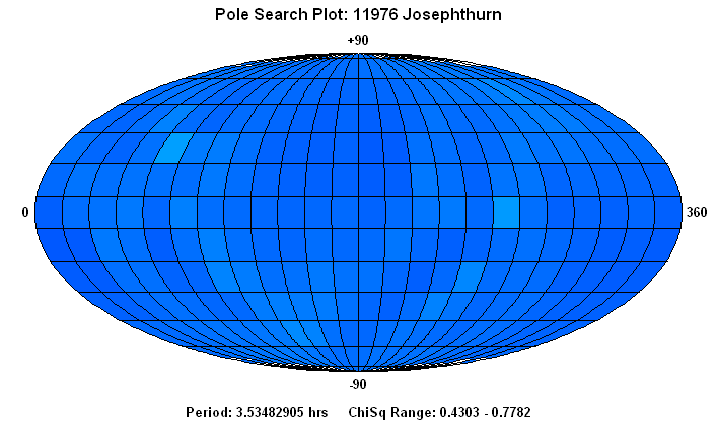
The pole plots scale from dark blue (lowest value) to red with maroon indicating the highest value.
The POLEREL plot uses the log10(ChiSq) values, sometimes with a multiplier
of the original value so that log10(X) is always greater than 0. This compresses the
color scaling at the low and high ends so that the extreme values stand out better.
The POLEABS plot uses the actual ChiSq values with dark blue representing 0.0 and
dark red representing any value > 5.0. There are 512 steps from 0 to 5, so each step
going from blue to green to red represents about 0.01 larger ChiSq value. The ABS plot
allows a direct comparison of each plot against all others.
| All Files | A11976.ZIP | Pole 1 | (5, -19) 3.534832 | |
| H | 14.3 | Pole 2 | (182, +39) 3.534826 | |
| pV | 0.3 | Pole 3 | N/A | |
| Diameter | 3.35 | Pole 4 | N/A | |
| Class | ES | Comments | A sea of blue | |
| Years | 2009-2013 | |||
| Dense LC | 11 | |||
| N 689 | 0 | |||
| N 703 | 107 |
| PAB Long | PAB Lat | |||
| Period | Shape | |||
| Pole Rel | Pole Abs |  |